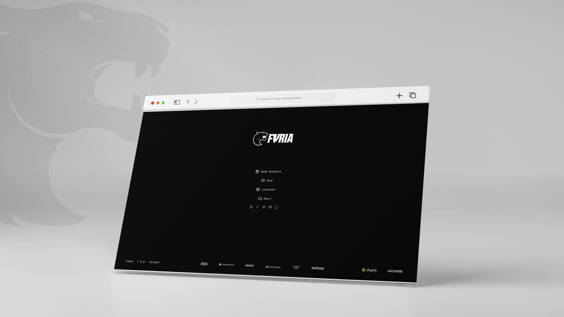
Furia
A brand new e-commerce experience for eSports fans.
My Role
Discovery, competitor analysis, low & high fidelity
prototyping, usability testing & validation.
Year
2023
Agency
Wicomm
About
Furia
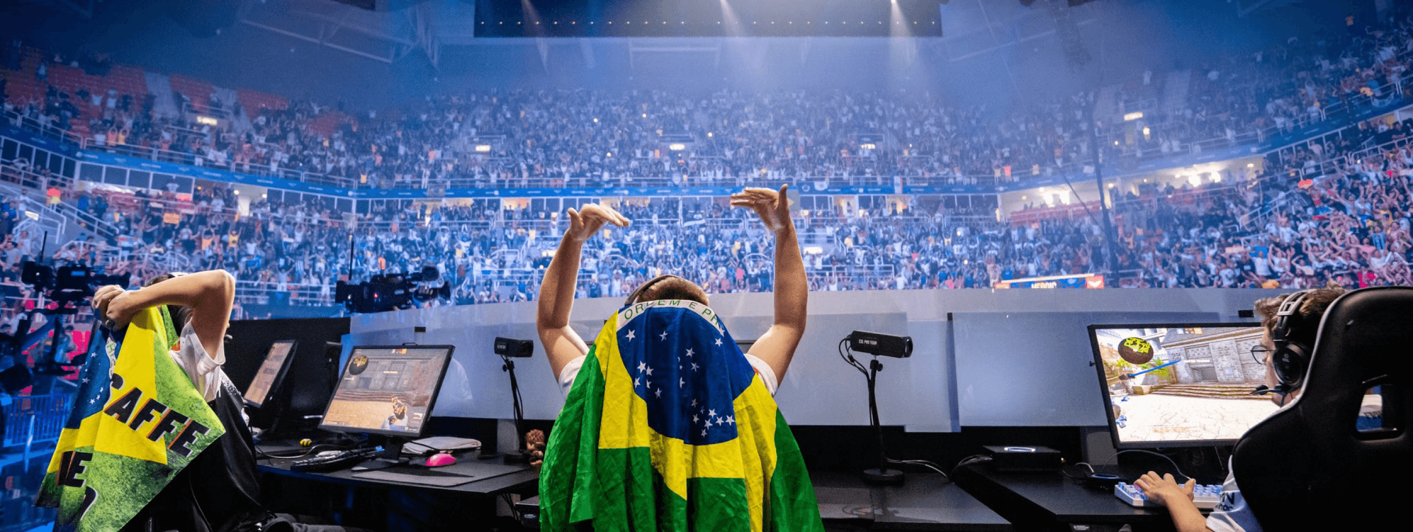
Furia is one of the biggest eSports organizations in Brazil and in the world. Founded in 2017, Furia quickly became one of the biggest revelations for the scene, participating in a number of national and international competitions, and bringing together world-class teams for various games.
Unfortunately, this project did not go live. However, It’s a great project that I was very proud of being a part of.
The challenge
To rebuild FURIA’s online shop from scratch and bring the e-commerce platform to the North America region. FURIA wanted to generate demand and hype around their products, and to bring something new to the eSports scene.
As the Product Designer, I worked closely with the Engineering Team during the entire project to successfully craft the e-commerce website from scratch.

Target Audience
For the Fans
E-sports fans are some of the most passionate in the world. FURIA’s target audience is composed of young, passionate and loyal e-sports fans. They already know the organization and want to show their support for their favorite team.
UX Research
Product Requirements and Design Audit of the current website
I collaborated closely with the team and other stakeholders to compile a comprehensive documentation of the design aspects encompassed within the project scope. To accomplish this, I presented my analysis of all the current pages, complete with screenshots of the existing product. Additionally, I outlined our design assumptions that needed validation through user testing and provided design references for each individual page, facilitating a clear understanding among all stakeholders regarding what to expect in the initial version of the web redesign.

The Solution
Urgency. Scarcity. Exclusivity. Uniqueness.
One of the most powerful sales motivator is scarcity. About 60% of people tend to make purchases because of FOMO (Fear of Missing Out). With that being said, the idea of limited drops immediately came to mind. We wanted to create a sense of urgency and scarcity for the users, something that would leave fans excited to buy an exclusive item. And when we have a brand with loyal fans and supporters, this becomes even more effective.

Focusing on what matters
Giving value to your time
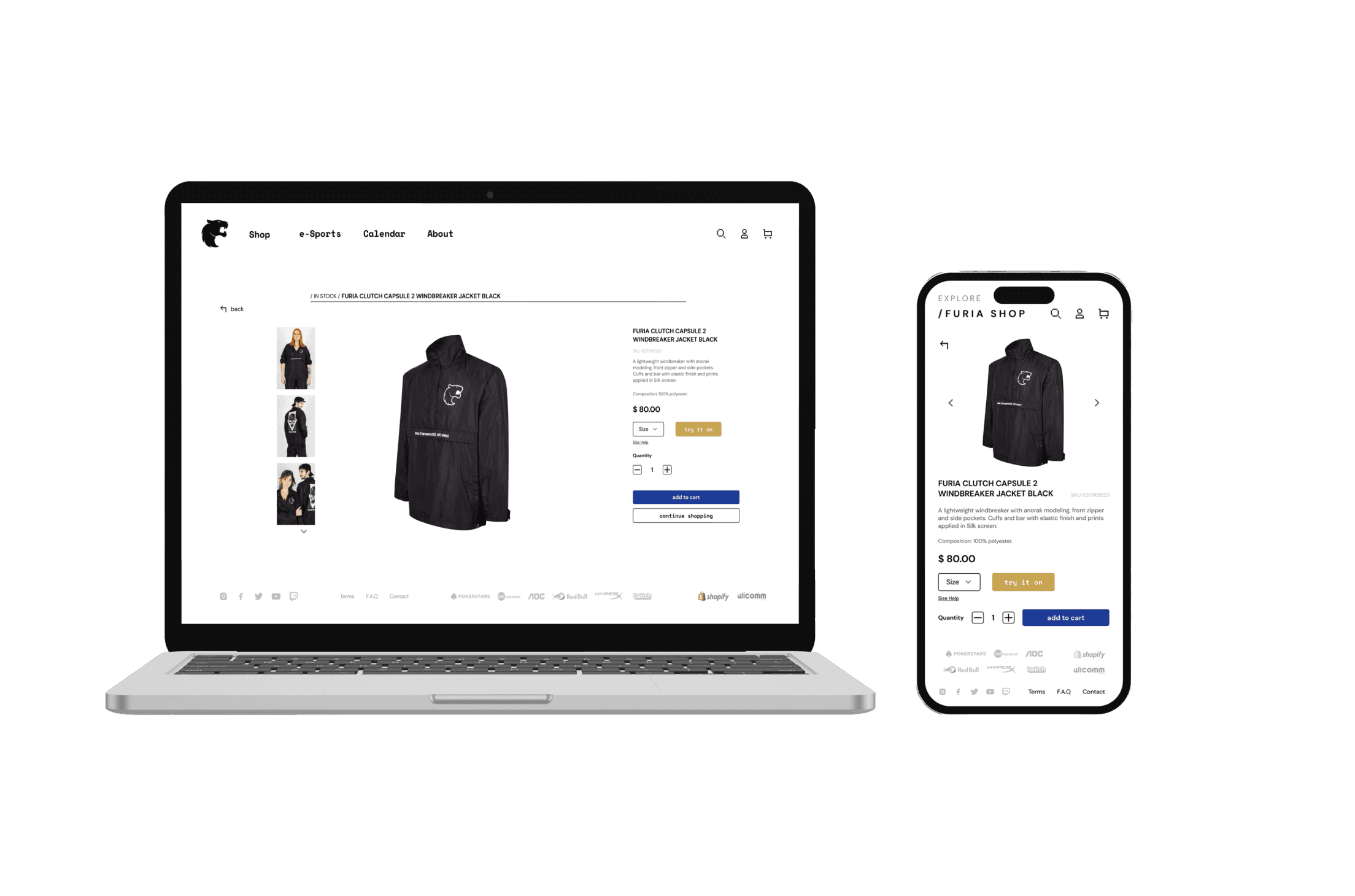
The goal for this platform was to simplify the navigation and the purchase process as much as possible, so that the user can quickly buy what they want.
Time is key, so we wanted to build a quick and easy path for the buying process. Keeping the scrolling to a minimum, we prioritized showing only the most important information.
Optimizing content.
Improving SEO and search metrics
It was important for us to improve SEO and the platform's discoverability by improving content, structure and overall navigation.
By collaborating closely with SEO and Marketing teams, we made sure to align strategies. This involved incorporating keyword research into content creation, optimizing page layouts for better crawlability, and ensuring that the information architecture supported a logical and user-friendly navigation structure.
Key Objectives
Keeping it familiar
Minimalism was an important factor for the design, but it was also important to follow the user’s mental models when it comes to shopping online. We didn’t want to create confusion for the user, so every information was exactly where they should be.
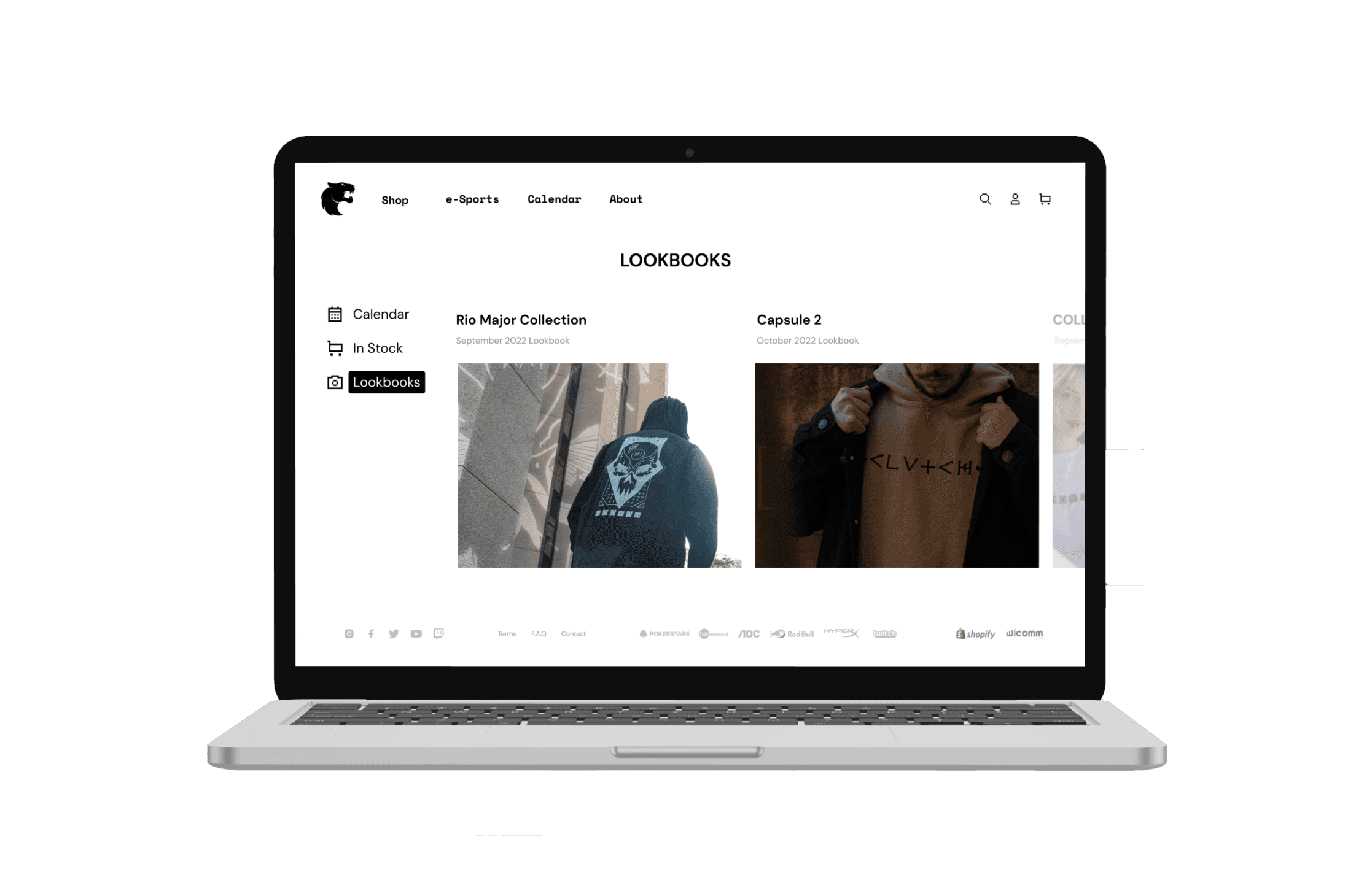
Take a sneak peak
Know exactly what you are buying.
Lookbooks are a way to preview the products and to see them in detail. Each drop is featured in the website before going live, making it easier for the consumer to know what to expect.
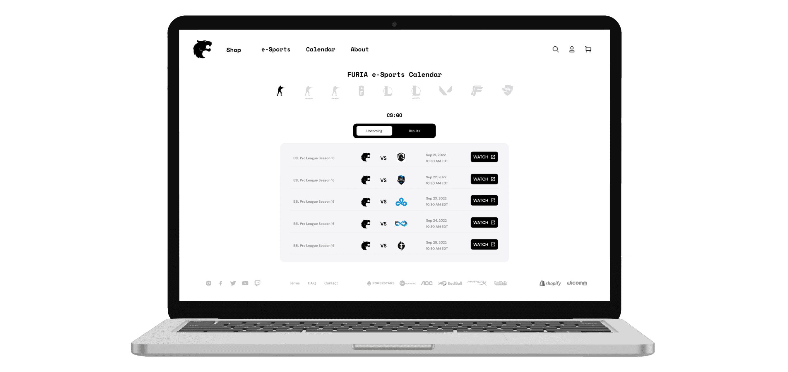
Follow your team
All the important information easily accessible
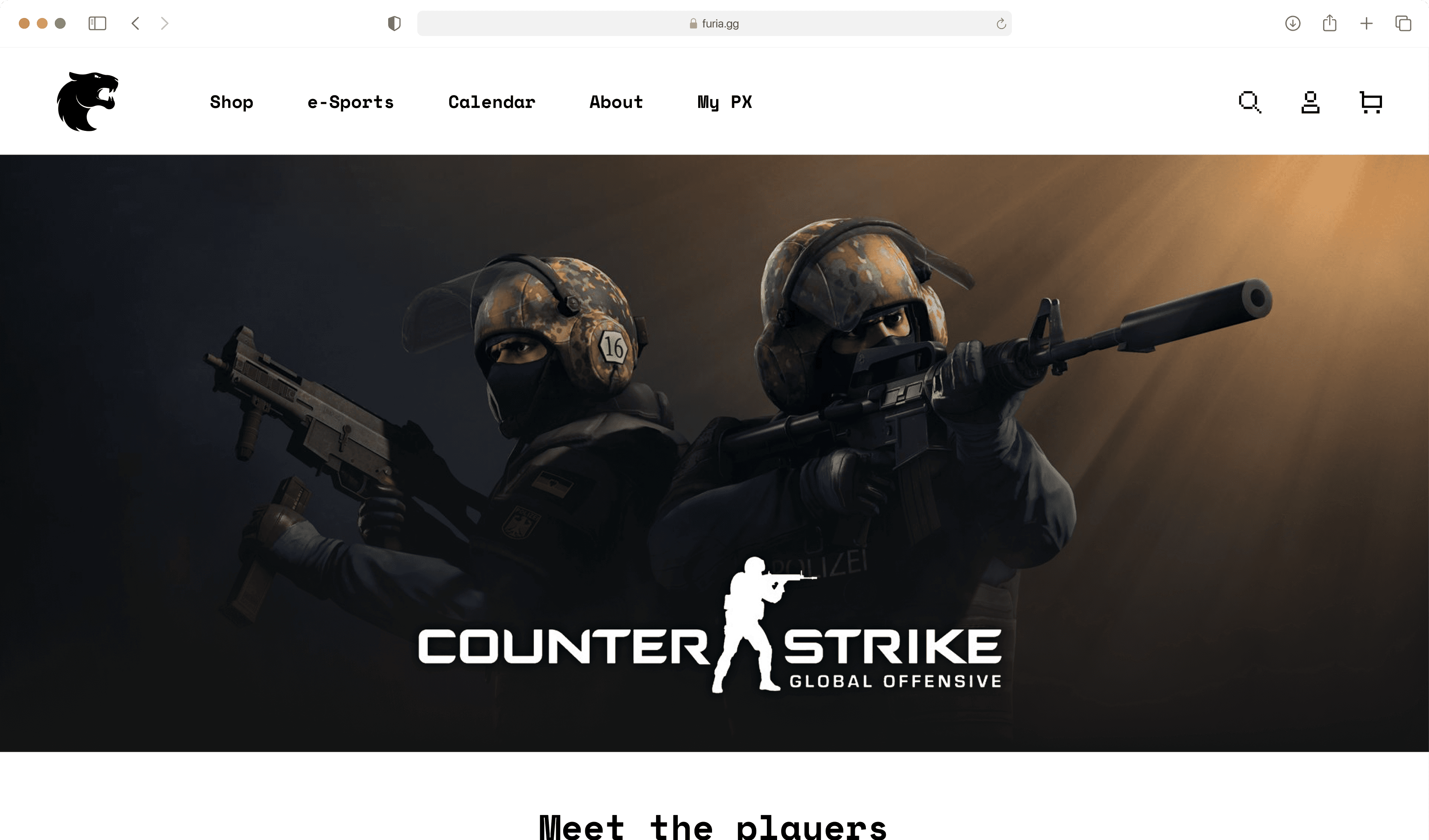
The Calendar is way to access the full schedule for all Furia’s teams. The user is able to access future games and past results, making it easier for the fans to follow their favorite team.

Know your team
Get to know your favorite players
We created a page for every team, highlighting player details, achievements and other important information about them.
Key Takeaways
Talking about success metrics
Although the project didn’t go live, we can still talk about success metrics we would’ve tracked had the project launched:
Sales Growth: The most direct metric to assess the success of the e-commerce platform. Highlighting the percentage increase in sales after the launch of the new website and comparing it to the previous period would offer clear insights on how the new features are affecting the business.
Conversion Rate: Monitoring this metric would allow us to assess the effectiveness of the design, usability, and checkout process. If there has been a significant increase in the conversion rate, it indicates that the website improvements are working.
Bounce Rate: Reducing the bounce rate is an important goal to ensure that users stay on the website and explore more pages, and would offer insights into how relevant the content is, and how usable is the website.
User Satisfaction: By measuring user satisfaction through satisfaction surveys, direct feedback, or analysis of reviews and comments, we would be able to assess the quality of the experience provided by the new website and how the UX improvements are positively impacting users' perception of the brand.
Repeat Customers: Increasing the number of repeat customers would indicate that the new website is generating brand loyalty and customer retention.
But what if we get negative results?
It would be important to anticipate potential negative results and have contingency plans or hypothetical pivots in place. We would need to Identify pain points and areas for improvement. This would be done through Usability Testing, content optimization, feedback gathering and conversion funnel analysis. The specific pivots would depend on the nature of the negative results and the insights gained from data analysis and user feedback.
Key Takeaways
Lessons learned
This project highly influenced my understanding of user needs, design decisions, and collaboration. The experience reinforced the importance of user-centric design, the need to align design decisions with project goals, and the value of effective communication and collaboration with stakeholders.
Key Takeaways
Future recommendations
This project highly influenced my understanding of user needs, design decisions, and collaboration. The experience reinforced the importance of user-centric design, the need to align design decisions with project goals, and the value of effective communication and collaboration with stakeholders.
Let’s work together.
Get in touch.
2024 Lucas Lima
Currently based in Curitiba - Brazil
More projects
Behance
Networking
